Monday, 21 November 2011

Font Ideas

These are some of the fonts I chose that I think would make good fonts for my magazine's masthead. I have also written what I like and don't like about them and why would they be good or not as font for the masthead.


 I like this font because it flows and has a surreal look. But I think it would be too hard for people to see off the shelves because it’s not that bold. It also looks a bit too feminine, and my magazine is aimed more at men. This means if they see the magazine’s cover, it might not appeal to them as much.


I like this font because it’s bold and has a more rocky feel. It would be easier to spot of the shelves and I think it would appeal to men which are my primary target audience. But I think that this font to more suitable for heavy metal magazines and does not fit my magazines personalty like I would want it to.


 I like this font because it stands out well and has a rough, slightly violent feel. It has a similar look to Kerrang magazine but the scratchy texture is less severe. I think this would appeal to my target audience and has that rebelliouse rock n roll attitude. But it looks a bit too square and doesn’t have it’s own charater which could cause readers to get bored of it.


I like this font because it’s similar to the first font, but it’s bolder and has a more rough effect. I think this would appeal to both the male and female audience without appearing too feminine.  My only concern is that it might not bold be enough to catch attention and the effect on the text makes it a bit hard to read by taking out parts of the letter.


I chose this font because it is bold and would stand out well on shelves. I think it would appeal well to the target audience and has the right style that would fit in well with my magazine. The rough effect is just the right amount so that it doesn’t make the text less readable and I like that the ‘E’ looks like its being pushed out. However I wonder if this font might appeal a bit too metal music instead of rock, but I still find it attractive.


I chose this font because I think the style of the text is what I would like my magazine to have.  I like the style of the ‘A’ and the overall rough and worn out effect of the text makes the font achieve an attitude. I think I would appeal well to my male target audience and just enough to the female target audience. The effect on the text could be a little too much and I don’t like the ‘A’ being solid but that may help to make the text stand out.

Double Page Spread Analysis

I analysed two double page spreads form two music magazines that have a similar style of music to mine. I did this so I could get some ideas of what my double page spread could feature about and so that I could get used to the features and their names of a double page spread. 


Contents Page Analysis

I analysed two contents pages from two different magazines similar to my style of music. I did this to analyse how a contents page helps it's readers to navigate through the magazine and what feature I could include in my own contents page.


Magazine Cover Analysis

I analysed the front covers of two of similar style magazines as my own. I hoped that this would help me get to know the conventions of a cover page, see what kind of similarities and differences they have and analyses how they both try to attract readers attention.


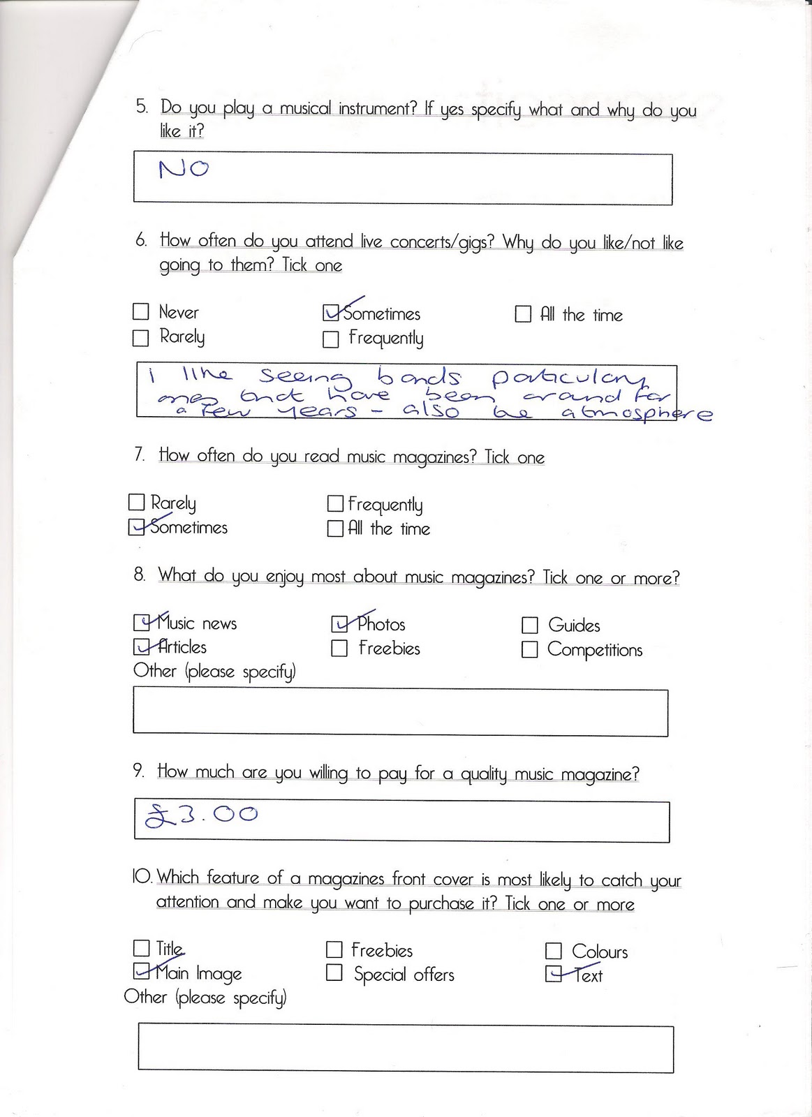
This is an example of what one of my questionnaires looks like after it has been filled out by a member of my target audience. I hope this will help me decide if I need to make any changes to my magazine's design.


Music Questionnaire final

After receiving feedback from my peers, I discovered that many of them thought that all the general questions should be given at the start of the questionnaire and all the questions that ask about magazines need to go  at the end, so I rearranged the question structure a little bit. I also discovered that I forgot to give a box for opinions on why or why not do my target audience like going to music concerts. I appreciated their input and put their suggestions into action.


Music Questionnare Pilot

I decided to make a music questionnaire because I would help me find out more about my target audience and what their thought are on what is a good music magazine. I asked a range of open and closed questions so people filling them in would not get bored and I asked questions that I knew would help me decide if I need to make any changes to the magazine, particularly the from cover. This is my pilot questionnaire that I will show to a few people and ask for their opinion and if any changes need to be made to improve it.


Wednesday, 9 November 2011

Investigating Mise-en-Scene


This is an image of Billie Joe Armstrong. Within this image both back lighting and profile lighting are used, creating shadows and almost a silhouette. The fact that most of his face is covered in shadow could mean that he wants his identity to stay hidden from the public or possibly from the law since the background is on fire meaning they could have done something daring that’s prohibited. In summary, the shadow gives him an enigmatic or nonchalant look.  The light on his face is a different colour to what you’d expect; meaning it’s coming from a different source we’re not aware of, adding to the enigma and making our eyes concentrate on the light that shines on part of his face.

The background seems to be on fire which is making the artist stand out. This could be highlighting the fact that the band wants to stand out in the music industry and the fire could represent their fiery passion for music and the phrase ‘we’re so hot, we’re on fire’ comes to mind. The brightness of the fire could also embody their talent and that their bursting with ideas. In addition the fire could represent a sense of rebellion.

The artist’s hair is made up in a messy fashion giving him a rebellious look which could reflect his personality and the genre of music that he plays. His body language of spreading his arms wide shows that he is bold, reedy for anything to come at him and not anxious about expressing himself. These kinds of personality traits are stereotypically assigned to men. You can also faintly see a microphone which is an example of music iconography.


This is an image of the Foo Fighters. In this image you can see that the band members starnd out because of their black clothes against the light grey sky backgroung of natural lighting. This can emphasize the fact that the band whiches to stand out and be seen as something that is completely uneqie and different. The sky background could symbolize that the band want to be free and be able to express themselves withought being restrained like birds in a cage.

All of the band members are wearing matching colours. This could mean that all the members believe theiy are equal and all have the same vision of what they what their music to bring to the music world. Since the colour is black, you’d expect the scene to be more sad or gloomy, but it actualt looks lively and energetic. So the band are purposfuly contrasting themselves from what the audience would think. Their body language indicates that their vigorous and full of life. This stresses the point that their ready to burst onto the scene and devote their strenght to their music.

All of the  band members also have a simillar messy hair style and facial hair. This makes them seem more ruged and gives them a ‘fighting back’ look. The scene also has a lot of  music iconography like the guitars, drumbs and amp. These items alre also closely linked with rock music because you usually see them in rock music videos and always at performances.


This is an image of MIKA.  As you can see, he is looking straight into the camera with a vicious expression. This makes him look bold and daring. The expression on his face almost looks like that of a cross spoiled child which makes us think of the riches of famous rock stars and that they have those riches at their disposal. He is also leaning into the camera with a kid of ‘bad ass’ attitude like he’s ready to fight. These personality traits that he is showing are stereotypically assigned to men.

The clothes that MIKA is wearing show that he likes the style of classic rock bands of the 60’s that wore similar outfits like the Beatles, but he has added his own twist to the outfit by attaching things like crocodiles to the shoulders and flowers and polka dots to the front. This adds to the childish imagery he is sending across and maybe even pointing out his personality that he is still a kid at heart. His hair is made up in a messy fashion to give him a rebellious look like many other rock artists.

The background of this image is of a messy and cluttered room. The mess adds to the childish look because children are known for not wanting to clean up their rooms. Or it could be laying emphasis on the stereotypical rock star attitude of trashing a hotel room after a performance. Either way, it gives of a rebellious feel and makes the artist look nonchalant about the current state he is in. There is also the some music iconography with the amps in the background, and the glasses with the Union Jack show a celebration of Britishness by the artist.


Sunday, 6 November 2011

Costume Ideas

The band members will wear costumes that will highlight their rebellious spirits and emphasize their fiery rock n roll attitude. Dark colours will be made to contrast with bright colours to make a visual statement that the band wants to stand out from the crowd and be recognised as something unique, but also that they want to leave their imprint in the world of rock.

Elements of the costumes will be co-ordinated but at the same time trying to keep the feeling of individuality and an ‘I don’t care’ attitude by letting the band members explore and improve their individual looks whilst at the same time encouraging fans to embrace their own uniqueness and applauding their individuality.

 To create glances of aspiration, they band members will ware clothes with childish or miscellaneous icons like skull and crossed bones or text that states random sayings that can be reflecting their personalities or almost controversial topics to show that band ‘aren’t afraid to go there’ and their confident enough to publicly display their opinions which most people are to scared to do. Or modern patterns like black and white stripes will be worn to symbolise criminals or people outside the law because one connotation of black and white stripes are criminal uniforms, which adds to the rebellious feel. But they also aren't afraid to ware something stupid just for the heck of it, and be set on making it their own 'thing'. It also shows they are up-to-date on some fashions. 

Women would ware pants or skirts depending on their personality, but they would not be de-feminized by the clothes, instead they would achieve subtle sex appeal by showing their legs through tights or show their character through the colours they like wearing. Their accessories also consist of bracelets, rings and necklaces, but that is to give them a a more feminine feel and show their income status if they want to show off. 

 Band members will also accessorise with small things like watches/bracelets or necklaces to show their more easygoing and modern side along with jeans which are commonly seen in rock bands. The clothes will also have a slightly worn look to show that the band members are in their comfort zone and performing is like second nature to them.

Tripp Red And Black Pleated Skirt - 999049
Black Military Button Jacket - 916244Black Grey Stripe Asymmetrical Knit Sweater Sku 913151Hello Kitty Easy Tiger Girls T-Shirt Sku 192775
Russett CapVans Black Pin Plaid Authentic Lo Pro Lace-Up Sneakers - 353015Dr. Martens Union Jack AirWair 8-Eye Boots - 977990
Volatile Stephie Tartan Plaid Wedge - 910203Black Fold-Over Plaid Lace-Up Boot - 996442Vans Stars & Stripes Classic Slip-Ons - 315880

Monday, 31 October 2011

Mission Statement

Anthem a new exciting and stirring music magazine that celebrates and promotes current artists in the music industry. The name Anthem summarises the fact that this magazine will feature musical content. At the same time the name symbolises that the magazine will become known throughout the nation just like its national ‘anthem’, it will sound-off loud for all to hear.  

There is a brand new generation of artists with great talents that just want to burst out and make it big. These artists have a strong determination to make an impact on the world and these are the type of people I would enjoy having featured in my magazine and something I know the readers would enjoy reading about in Anthem magazine.

The magazine will be distributed monthly at a price of £2.50. It will be available for purchase at all large newsagents and supermarkets like Tesco, Sainsburies and WHSmith. It will also be available in most music retailers. The readers will also have the option to the magazine via the magazine’s website www.anthem.co.uk or through post.

Anthem is primarily a music magazine, which will be reflected in its content. The magazine will include content like interviews with new up and coming bands; reviews of gigs, albums and singles; inspiring articles of bands that have made it and want to share their experiences with the new generation. There will also be the reader’s favourite artist profiles thus the magazine will fulfil the general interests of its readers. Articles will include things like top 10 songs of the month and feature articles on one specific artist along with competitions, reviews and music news. The readers like live music so the magazine will also include news of up and coming gigs. The magazine will also occasionally commemorate a specific time in history where rock was embraced all around the world thanks to artists like Elvis and The Beatles.

As a magazine, Anthem promises to deliver information on the latest music news on artists, albums, gigs and competitions. Anthem also promises to entertain its audience will excusive interviews and inspiring stories of successful artists that hope to inspire the readers to follow their musical dreams. The magazine will also promise to reward its readers for staying faithful and continuing to purchase the magazine. Once in a while, the magazine will have some kind of cover mount, such as a code for a free download, CDs of featuring tracks by current artists, or smaller cover mounts like guitar picks. The CD's could sometimes be by 'yet to be discovered artists', that the magazine is helping to promote and pull in readership that is looking for new sound, at the same time helping to support the aims of the magazine. Some of the artists we are looking forward to presenting are The Foo Fighters, My Chemical Romance, Gorillaz and Simple Plan.

There are also chances for readers to win prizes with each issue of the magazine. Some might give the opportunity to win tickets to gigs, others might give the readers the chase to become VIPs at a concert and meet their favourite artists and everyone has a chance to register with the website to receive all of the up to date information and exclusive offers.

This magazine believes that it is important to celebrate music because it is such a dominant part of our lives. It will feature a range of artists, but just because the music industry tends to be dominated by males does not mean we will limit the content to mostly males because we believe that females have had the same impact in the music business as men, so there will be articles of female artists that will not try to de-feminise.
The magazine will encourage the reader to embrace their musical side and feel uplifted enough to help them recognise their own strengths and potential.

The style of Anthem can be described as unique and modern with a touch of youthfulness and free spiritedness. The readers will find it stylish and informative, but also that it can be friendly and almost childish at times to show off a slightly juvenile side. The style of my magazine therefore matches the style and qualities of my audience ensuring that they can feel that they can relate whilst enjoying reading the magazine.